 "ruester cogburns" cover page. it was a harrowing process to make the screen for the border/filigree (i'm officially at guerrilla-status when it comes to the school's print lab), and ended up taking about a week -- first tries where confounded by faulty equipment, then poor screen quality. i went with the "-ue-" version, over the "-oo-" or "-ü-" just for consistencies sake. as the collection was inspired by john wayne's "true grit", all the jean cuts are named after olde west firearms.
 "select smith & wessons." this is the high-end model. features selvage seams which are intended to be rolled up into cuffs. also features embroidered monograms on the back pockets. the shirt features overlaid patch-work on the breasts.
 "ithaca fully loaded." cargo jeans. there's a lot going on with these pants, and i like the busy-ness. those are patches over the knees.
 "dropped derringers." low-rise jeans. yes, only the left back pocket is red (screen printed denim). and i'd rock that raglan jacket so hard...something about horizontal corduroys...
 "schofield breeches/breechlocks." the boot-cut jeans. the boot-cut made me really identify with olde west gun-slingers, so i made a little inlaid section on the right thigh reminiscent of a gun holster. also an extra seam around the leg at this point, representing the holster's lanyard. i'm really fond of the double-brested jacket as well (the "butt-stock" flap on the right gets me all loosey in my goosey).
 "colt-cuts." the regular/basic/standard jean cut. they feature seam tags at the hem, which would be printed/embroidered with the rooster logo.
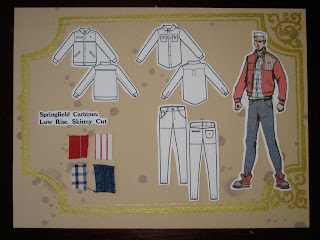
 "springfield carbines." this is the "hipster" look. you can tell because the jacket is red (instead of brown), the shirt is blue (instead of red) and the jeans are tapered super-narrow by darts at the hems.
 "winchester straight shooters." straight-legged jeans. i really, really like the multi-colored jacket fabric: amazing slubby cotton fabric from...japan of course. must they continuously rock so hard?
 "blessed brownings." a horizontal corduroy look. apparently this has already been started by a local sf company lindland's. here's a link to their "cordarounds"
 back page of book-binding. ruester's slogan is featured center: a riff, off of a line a drunk at a bar thought was quite clever.
HOORAY! IT'S DONE! more work could have been spent, but such is always the case. now onto the hackafore pan-pacific surf safari collection...

4 comments:
I am full of awe.
And no umlauts. Thank goodness.
whý nø ümlãúts?!
wooo congrats! Every exhibit of your current stuff seems to get slicker and more polished. Poses on the fashion figures looks really nice and natural now too.
my heartiest agreement with the beaut of a jacket fabric! Dig he tweedy texture too. The contrast pocket is a rock solid element to the design as well.
Really enjoy the structures and unique-looking shapes on the jackets. unfortunately though can't really tell a lot of the pants styles apart. One thing I'm really digging about the whole collection is the emphasis on a variety of heavy materials with distinctive textures. Goes well with the central Western Hero conceit while remaining visually appealing. Always enjoy looking at /hearing about your design process....
point of order:
http://world.menu.ru/Fairytales_gone_sexy.html
Post a Comment