Showing posts with label okianos. Show all posts

Wednesday, January 6, 2010

okianos loose ends


cover! it took awhile to upload the project, what with the holidays and my computer fritzing out (and the subsequent return trips to apple to fix stuff they broke during previous repair jobs) *angry fist shake*

ah well, ain't no thang. just "ride the tide"


credits page. the japanese says, "arigato gozaimasu okinawa no ama," which of course translates to "much thanks diving women from okinawa!" you might remember the top logo from a few years ago


mood board. can never have enough mood-setting!


customer profile. *dawwwwww* surfing really tuckers you out


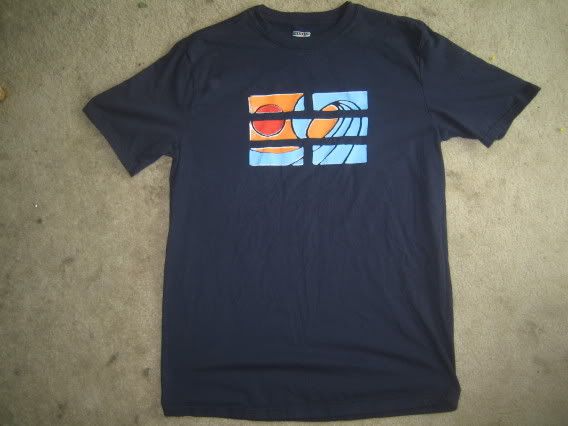
look 1. stoked on the jacket. also features the sampled shirt from a few posts down


look 2. pleased to get the back pant patch rendered for this project. a little angular, but you get the jist


look 3. 3/4 sleeve poncho and the sampled cut-offs from the previous post


look 4. this one garnered some nice reactions from the girls in class. must be the hat


look 5. this was the first croquis i drew for the collection and it shows... of this look, the undershirt (with contrast sleeves!) is my fave


look 6. chock full of yes! the jacket...guh. and i'm working on making a pair of the jeans (probably in the chocolate/khaki bull denim left over from my denim jacket)


look 7. top to bottom pretty keen on this one. the leather jacket's the lone remaining piece of maori influence -- mimicking the protective skeletal shapes of the upper torso. the shorts are obviously selvage. obviously


look 8. i was excited about this jacket -- which features the enoshima mon -- but the fabric photoshoping came out a bit too choppy. and those pants...had to zoom in on the texture with mixed results


look 9. ponchos! there were a half dozen poncho designs, and this "little red riding hood" won out


look 10. features a full-on happi, which naturally makes me happy. pretty keen on the 3/4 undershirt as well


look 11. this one came out a little...too "castro"


look 12. solid.


back page featuring the mon logo from enoshima sushi

hooray! done! now to ship the project off for summer internship aps...

Tuesday, December 15, 2009

cut-offs ahoy-hoy


1st sample for the okianos collection: some denim cut-offs. the major design innovation are the pocket flaps, which snap closed for added security (i lost a phone once doing hand-stands at the beach).


front detailing pocket flaps. the pockets snap into a closed position right below the waistband at the side seams.


inside view. lots of flannel pocket lining...


close up of the cut-off hems


back view!


close up of back view patch and double welt pocket. the back pockets are lined with the flannel!

2nd sample/final done!


2nd okianos sample/construction final garment, a nice navy polo shirt. the self fabric is some kind of ripstop material (meaning there are extra nylon threads spaced into 1x1 mm grid woven into the fabric) but unlike normal ripstop (eg. backpack material), mine feels very soft to the touch -- almost like a cotton. have to figure out what that is...maybe a carded polyester?

the red striping is a little design feature, and is made up of a red polyester/lycra/cotton wicking fabric (the same fabric as used in my lumberjack long sleeve). the design is from the okianos logo, which is itself a variation on the water i-ching. it seems fitting as this section will be dealing with moisture-related matters.

shiny buttons! *handclap* went with the pearlescents to evoke the abalone and well...pearls the ama divers swam for.


close up of the front of the shirt. the red wicking contrast fits snuggly against my chest (the shirt's about a size too small in the shoulders for me) which would seem to indicate the fabric should be ideally positioned to help discharge sweat and keep the wearer oh so fresh!


inside view of the shirt. you can really see the red masking tape around the collar, and all the red overlock thread around the major seams.


close up of the inside view of the shirt. sammich'ed behind the button facing are the understiched button holes, also in red threading to continue the theme. my two regrets for this garment were not overlocking the contrast section innerlays (where the red and blue meet center chest), and forgetting to insert a branding tag on the lower left of the shirt hem (i made the tag and everything, just forgot about it until after the sides were stitched up). but then again there's something visceral about the raw edges that gives it something i like...

Saturday, December 5, 2009

okianos

here are some photoshoped images to help establish the mood for my second design project. the theme was a surf safari to okinawa, from which i generated the brand name, "okianos" (also a derivation from the titan oceanus/okeanos).


fisherman and shisa/siisaa (mythical fox/lion protector/gargoyle from okinawa)


a big influence came from the female ama divers. apparently, women are better divers than men due to higher percentage body fat (keeping them warmish) and greater lung capacity. the fifth installment of the james bond series -- "you only live twice" -- features these divers heavily, and in the original book the movie was based on, james marries and sires an heir with one of the ama.


my favorite. the plaid was swiped from designs of the manobo tribe from the philippines island siargao.


if japanese men were left to do the diving, they'd probably start using these suits (kinda evoke giant robots, no?). the crests are from karate(?) dojos bryce was associated with: shito ryu, and shotokan. the red circle crest rotated 90 degrees formed the logo for my okianos line (when rotated such, it also resembles the i-ching symbol for water).


the ama traditionally dive topless, so the girl's top here is hastily cobbled together in photoshop. the yellow/red head scarf design is actually swiped from another divers' bottom trunks. scandalous.


the background is from the okinawan screen-printing method called "bingata." the method is characterized by utilizing a rice paste to block out the negative areas of a design (similar to the photo-emulsion or latex screen filler i use). designs get quite intricate and center around a color palate of umber/red and indigo.


nude women divers generated quite a stir on japanese coastlines in the 1960s, so the women began to organize themselves into collectives. the divers began to wear shirts when diving, which negatively affects the ability to glide through the water. as a result, fishing catches declined and the women shifted their focus to entertaining tourists with displays of their lifestyle.