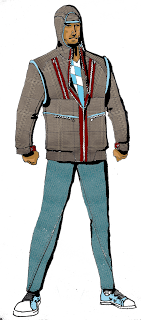
development process for a look. started with the vitruvian man, and from there sketched a quick figure for color options. the figure on the right is my favorite version of the drawing through the whole process. somehow i need to make that the final, but it's just so....sketchy :(

penciled figure for final presentation. gotta start somewhere

after a round of micron inking. i've been using .08 for heavies, .03 for mid tones, and finishing with .005 for stitching details. i like the roughness with the pencils showing through (as do my instructors), just need to find an acceptable way to express that in the final renders....hurm. thoughts?

cleaned up inks. went back over the figure with a tombow brush pen to add some depth.

rendered croquis in photoshop. pretty happy with the way the fabric came out.

back to the drawing board; trying to play with silhouette and proportion a bit before the new semester. gotta get it nailed down!

2 comments:
Hmmm sketchy yet finished linework? Shaken but not stirred? That's a tough one considering that you need to have your explicit background patterns be your actual fabrics.
Actually I was struck by how much personality there was in the pen lines--those varying weights look really great, and its a technique that's improved visibly since your last post! You have a great feel for what the weight needs to be at a certain point, but I think your hand is still learning the finer motion of how to execute it. What you might want to do is use the photoshop brush pen tool. I think that doing so might make you more bold with your linework so you could incorporate a more distinctive personal style. For brush pens, I like the nice cheap, easy-to-find Pitt brush pens from Faber Castell (everyone's got em, only 3 dolla a pop in a variety of greytones etc)
Another suggestion is a trick that I use very often, the col-erase underlying color with a darker color on top. The look of good ol grey graphite can be kind of a drag (looks a bit dusty, messy), but this can be remedied either by "replace color" in photoshop or by the use of a col-erase. You could spare the interior of each shape as well by erasing away from the inside but leaving the skethy lines on the outside, or by sketching out a vitruvian-style background by hand and overlaying your figure perhaps?
Really digging this hood! Can't wait to see the prototypes :D
The poses on the dude are a little superhero-esque (clenched fists, 3/4, chest out)...you might be able to throw your instructors a bit off the costume-y trail a little more with some more varied poses that still maintain the full front perspective. For instance the chin tilt on the face (eg this girl: http://www.booooooom.com/wp-content/uploads/2010/11/Jordis_Antonia_Schlosser_03.jpg ) or this guy's arm positions ( http://www.booooooom.com/wp-content/uploads/2010/12/Alexandra_Demenkova_05.jpg ) and still show off the textile goods!
Post a Comment