
tried to define the bartender more and fix up the poses...
right now I'm working in a simple, single b/w layer so that I can get figures and setting right before I move onto lighting.
all other drafts/previous version on the photobucket account
I'm fairly happy with the perspective lines now, and I feel like the figures are becoming more believable. It needs a few more figures to flesh out the scene though...
But I really don't like how the general lighting lacks depth. I'm thinking about a lot of different colored lighting sources to enhance the depth.
I also don't like how this scene lacks the fluidity and drama of the original version with more colors (draft2 post). I think this is due to the crop, and the lack of foreshortening on the bottom of the figure. I'll try to increase the width more towards the bottom of her figure to try to emphasize the fisheye.
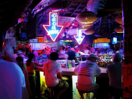
example: colors of the neons adding depth and emphasis in this bar photo from online...
1 comment:
i started diving into the piece last night and i must say that gave me a much greater appreciation for your detailing work thus far. there's still something just off about her hand though. it seems a bit long and i'm not sure if that's her thumb on top, behind the glass or if i'm just not thinking post-human enough.
i've been trying to build up some color layers behind your...um..."inks" i guess would work in describing them, but the draft's a bit crazy right now. the color palate from your attached image i think will work quite nicely. oh, and i've been trying to integrate some signage into the background, but they're still a little too conspicuous. ...have to work on that.
*ack* chinese final in 2 hours! jin tian wo tai hen mang...
Post a Comment